Notifications
Posted by - Support KAAYXOL -
on - 2 hours ago -
Filed in - Technology -
-
2 Views - 0 Comments - 0 Likes - 0 Reviews

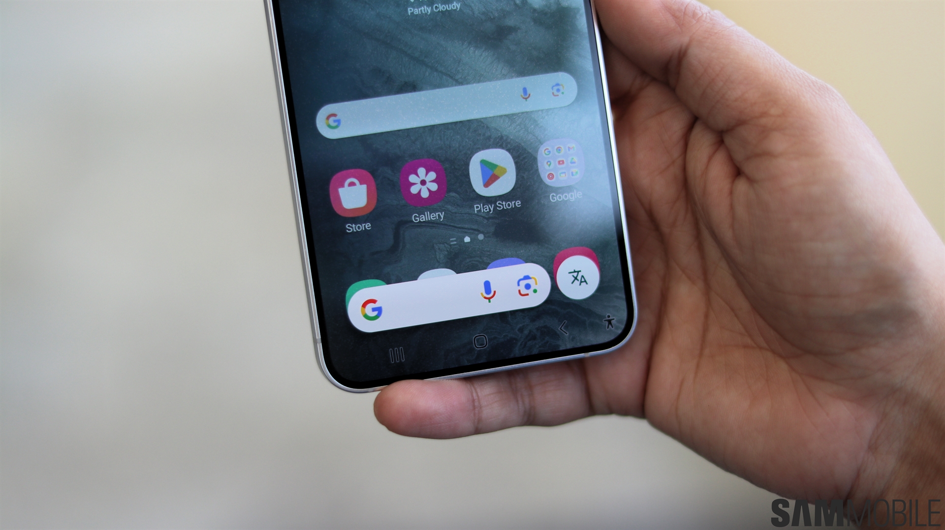
Although the functionality of Circle to Search hasn't changed much since it debuted on the Galaxy S24 family of phones, Google seems undecided about its UI design. A teardown of a Google app version in development shows that the company is again redrawing the UI of Circle to Search.
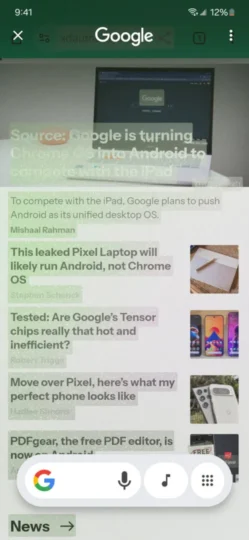
These recent findings in the Google app (version 15.45.43.ve.arm64 beta) reveal a redesigned Circle to Search UI that has a new button shaped kind of like a traditional app drawer (via Android Authority).
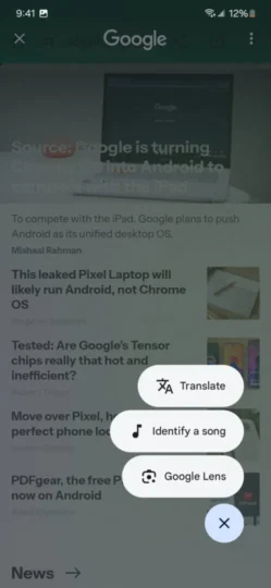
Functionality-wise, it's more like a toolbox than an actual app drawer in the true sense of the word. When tapped, this button reveals a small pop-up menu containing different Circle to Search functionalities, including “Translate” and “Identify a song.”


Even “Google Lens” is included in this pop-up toolbox, oddly enough. As confirmed by a Samsung Community moderator not long ago, the Lens option got removed in a recent Circle to Search update “due to a change in the concept of the Google app.” It now seems like it might make a comeback.
One last unusual design element revealed by this recent Google app teardown is that the “Identify a song” option exists in two places, both in the toolbar and the new pop-up menu.
This redundancy could merely be the result of this Circle to Search UI redesign being incomplete. Or it could hint that the new UI might have a user-favorite slot that could accommodate any other Circle to Search tool.
The post Google is working on a toolbox UI for Circle to Search appeared first on SamMobile.

